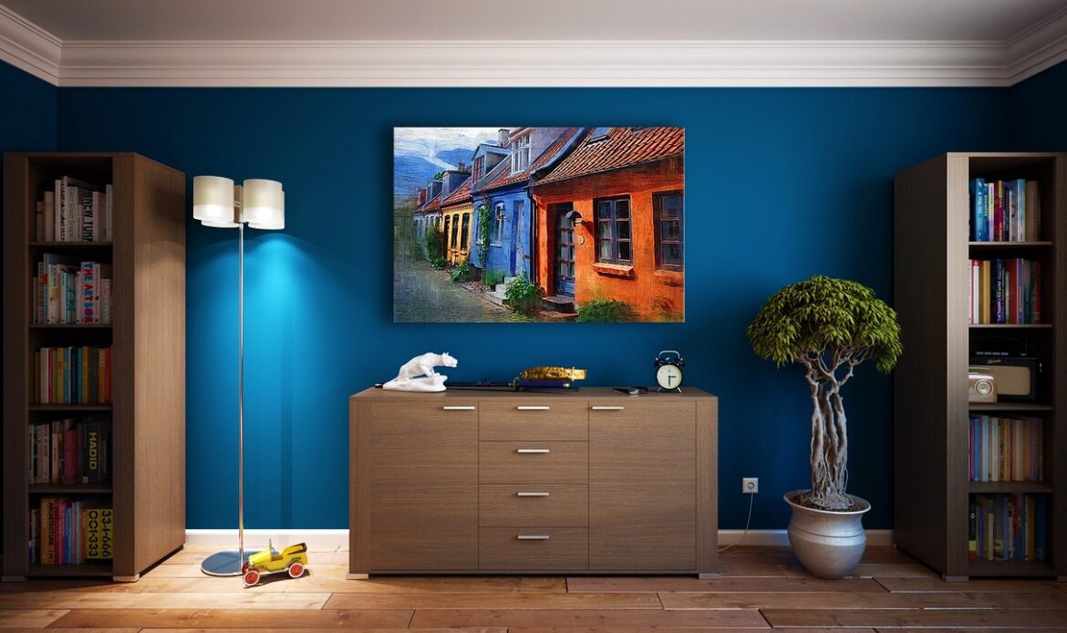
Deciding on colours for your home can be overwhelming with so many to choose from. Whether you’re doing a full home renovation or a single room refresh, the colours you choose set the tone for your space, your mood and even how big or cozy a room feels. In this post we’ll explore modern colour palettes for home renovations that will inspire Toronto and GTA homeowners to create beautiful, comfortable and functional spaces.
From warm neutrals to bold accent combinations, we’ll show you how to choose colours that match your lifestyle, lighting and room size. We’ll also share tips on how to transition between rooms and colour palettes that work for Canadian homes. By the end you’ll have a clear vision for your renovation and it will be easier to turn your house into a home that reflects you and your style.
Table of Contents
Why Colour Palettes are important in Home Renovations
When renovating your home, the colours you choose play a bigger role than most homeowners realize. The right colour palette for modern home renovations can totally transform a space, making it feel bigger, brighter and more welcoming. Colour affects mood, energy and even how we see furniture and fixtures. For example warm neutrals can create a cozy relaxing space, cool greys or blues can make a room feel calm and spacious. Choosing wisely means your renovated spaces will feel balanced and harmonious.
Another important factor is lighting. Natural and artificial light changes how colours look throughout the day so a palette that looks perfect in a showroom may look different in your home. Room size, orientation and existing finishes like flooring or cabinetry also affect which colours will work. Modern home renovation colour schemes should consider these elements so the final look feels intentional and timeless. By choosing wisely, homeowners in Toronto and the GTA can enhance their spaces, create a flow between rooms and get a stylish result that reflects their lifestyle.
Top Colour Palettes for Modern Home Renovations
Choosing the right colour palette can completely transform your home, making it feel brighter, cozier, or more modern. In this section, we’ll explore some of the most popular colour palettes for modern home renovations, helping Toronto and GTA homeowners pick the perfect shades for their space. Each palette includes tips for which rooms it works best in and why it’s a great choice for modern homes.
1. Warm Neutrals & Greige
- Description: A mix of beige, soft taupe, and off-white creates a warm, inviting base for any room.
- Best for: Living rooms, hallways, and open-plan spaces.
- Why it works: Warm neutrals reflect light, make rooms feel larger, and provide a versatile backdrop for furniture and décor.
- Local tip: In Toronto homes with northern exposure, warm tones can balance cooler natural light.
2. Earth Tones & Biophilic Hues
- Description: Shades like sage green, muted terracotta, and denim blue paired with natural wood finishes.
- Best for: Kitchens, living rooms, and bathrooms with natural textures.
- Why it works: Earth tones create a calming, grounded environment and bring the outdoors inside—a perfect fit for modern Canadian homes.
3. Monochromatic Minimal & High-Contrast Neutrals
- Description: Crisp whites, soft greys, and charcoal accents create a sleek, modern look.
- Best for: Condos, bathrooms, and transitional spaces.
- Why it works: High-contrast neutrals offer a timeless design that’s easy to update with furnishings or accent colours.
4. Bold Accent Colours with Neutral Foundation
- Description: Neutral walls paired with striking accents like navy, emerald, mustard, or burgundy.
- Best for: Dining rooms, feature walls, or cabinetry.
- Why it works: Adds personality without overwhelming the space, keeping the overall design modern and stylish.
- Local tip: Bold accents can make a statement in Toronto homes while complementing neutral tones in the rest of the space.
5. Soft Pastels & Calm Hues
- Description: Gentle shades like dusty lavender, blush pink, pale blue, and pastel green.
- Best for: Bedrooms, bathrooms, and small spaces that benefit from a soothing atmosphere.
- Why it works: Pastels make rooms feel airy and relaxed, ideal for homes in dense GTA neighbourhoods or smaller interiors.
Each of these palettes can be tailored to your specific renovation project, whether it’s a full-home remodel or a bathroom upgrade. By understanding the mood, light, and size of your rooms, you can choose a colour palette that enhances your space while keeping it modern, functional, and stylish.
How to Choose the Right Colour Palette for Your Renovation
Choosing the perfect colour palette can seriously make a big difference in how a house feels and functions. When planning a major refurb, you’re not just picking a colour you like – you’re trying to get some harmony going between the space, the furniture, the lighting, and your overall style. By taking a few key principles on board, you’ll be able to choose a colour palette for modern home renovations that not only looks great but also feels comfortable.

1. Take into account the existing finishes and fixtures
Before you start choosing colours, take a good look at what’s already in your home. Flooring, countertops, cabinets, and trim can all have a big influence on which palettes will work best. For example, warm wood floors are just begging for something neutral or earth-toned, while cool-toned tiles can work really well with blues, greys, or muted pastels. If you match your palette to your existing finishes, you’ll get that all important cohesive look throughout your whole refurb.
2. Think about the function of each room
Different rooms have different jobs, so your colour choices should reflect that. Living rooms and kitchens are the kind of places where you want colours that’ll make you feel lively and welcome, while bedrooms and bathrooms are more suited to calming, soft hues. And if you’re doing a bathroom, light neutrals or gentle pastels are a great way to make a small space feel brighter and more airy.
3. Think about the lighting and room direction
Lighting can completely change how colours look in your space. In rooms that don’t get much natural light – like north-facing rooms – warmer tones can really help balance things out. And in rooms that get loads of natural light – like south-facing rooms – you can get away with deeper, richer accent colours. Always test out paint samples at different times of the day to see how your colour palette will really work in practice.
4. Make sure the colours flow between rooms
A good colour palette should make it easy to move between rooms without getting jarring colours clashing. In open-plan homes or when you’re renovating lots of rooms at once, coordinate your colours so they complement each other rather than getting in each other’s face. One trick that works is the “60-30-10 rule” : 60% of a room is the main colour, 30% is a secondary shade, and 10% is an accent colour. This gives your space a nice balance and makes it look really nice.
5. Get some swatches up on the wall before committing
You should never choose a colour without seeing it in your home first. Paint some swatches onto the wall or use sample boards to see how the colour looks with your lighting. A few small tweaks now can save you a whole lot of hassle – and expense – later on, and make sure your colour palette actually matches your vision for the space.
6. Get some expert advice if you’re really stuck
If you’re not sure where to start with your colour palette, get some advice from a pro. Someone who’s done loads of renovations will have a good idea of what works and what doesn’t, and can suggest palettes that really work with the way your home is laid out, the finishes you’ve got, and the lighting. With a little bit of guidance, you can choose a colour scheme that really brings your home’s style and functionality to life.
Why Ahoora Homes is Your Colour Palette Partner in Toronto & GTA
Picking the right colour palette for a home renovation can be tough, especially if you’re not sure how colours will work with lighting, room size and existing finishes. That’s where Ahoora Homes comes in. As a trusted renovation company serving Toronto, North York, Richmond Hill, Aurora and surrounding GTA areas, we guide homeowners through every step of choosing and applying the right colours for modern home renovations.
Here’s how we help you make informed colour choices:
- Expert Advice: We show you modern colour palettes for home renovations and how to combine neutral tones with bold accents.
- Room-Specific Solutions: Whether it’s a living room, kitchen or bathroom, we make sure the colours work for the function, lighting and size of each space.
- Seamless Flow: We help create a cohesive palette throughout your home so each room flows into the next.
- Material & Finish Matching: Our team considers flooring, cabinetry, tiles and fixtures to make sure your palette works with all finishes.
- Local Knowledge: We know what works best in Toronto and GTA homes, from lighting conditions to style preferences, so your renovation feels modern and functional.
Also Read: https://ahoorahomes.com/eco-friendly-renovation-tips-for-a-greener-home-in-ontario/
Conclusion
Choosing the right colours can totally change a home, make it feel modern, warm and functional. By knowing modern colour palettes for home renovations in Toronto and the GTA you can pick colours that reflect your style and enhance each room’s mood and flow. From warm neutrals to bold accents to soft pastels the right palette will give you a cohesive look for your whole home. Working with experts like Ahoora Homes will ensure your colours work with your lighting, finishes and your renovation goals.
Frequently Asked Questions
-
What are the most popular colour palettes for modern home renovations in Toronto?
The most popular palettes include warm neutrals like beige and greige, earth tones such as sage and terracotta, bold accents with neutral bases, and soft pastels. These combinations work well for living rooms, kitchens, and bathrooms, creating a modern, stylish look for Toronto and GTA homes.
-
How do I choose the right colour palette for my home renovation?
Start by evaluating your room’s lighting, size, and existing finishes. Consider the function of each space and how it connects to adjacent rooms. Using modern home renovation colour schemes strategically ensures a cohesive, balanced look throughout your home.
-
Can bold colours work in a whole-home renovation?
Yes, bold colours can be used effectively if balanced with neutral bases. Accent walls, cabinetry, or feature pieces allow you to introduce vibrant tones without overwhelming the space, creating a stylish and modern look that flows across rooms.
-
How does lighting affect my colour palette choices in the GTA?
Lighting has a major impact: north-facing rooms receive cooler light, so warmer tones work best, while south-facing rooms can handle deeper shades. Artificial light also changes how colours appear, so testing samples in each room is essential for accurate results.
-
Will trendy colour palettes affect my home’s resale value?
A well-chosen palette can enhance resale appeal if it stays modern yet neutral. Using popular colour palettes for modern home renovations like warm neutrals or subtle earth tones ensures your home remains attractive to buyers while still reflecting your personal style.

